Your content looks like it is ready to be published and you're ready to save your content as "Needs Review," but wait! You need to check your content against the brand new accessibility checker first. Learn how to use the new accessibility checker now.
Location
The accessibility checker is located in the bottom right hand corner of the screen and looks like a circle that is either blue, yellow, or red. It will not appear in the editor but will appear on pages that are published, in draft mode, or in Needs Review (when your content has a pink background behind it).
Blue
Blue indicates no errors, but be sure to also check your content against the Content Review Guidelines manually.
Yellow
Yellow indicates a manual review is needed for potential errors.
Red
Red indicates an accessibility error was found and should be corrected immediately.
Using the Checker
The best practice for using the checker is to:
- Save your content as a "Draft"
- Look for the checker in the bottom right hand side of the screen.
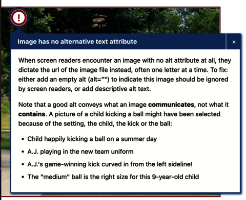
- If it is yellow or red, click on the circle to open the panel. This will bring up the "Issues" tab and highlight the errors in your content like in the screenshot below.
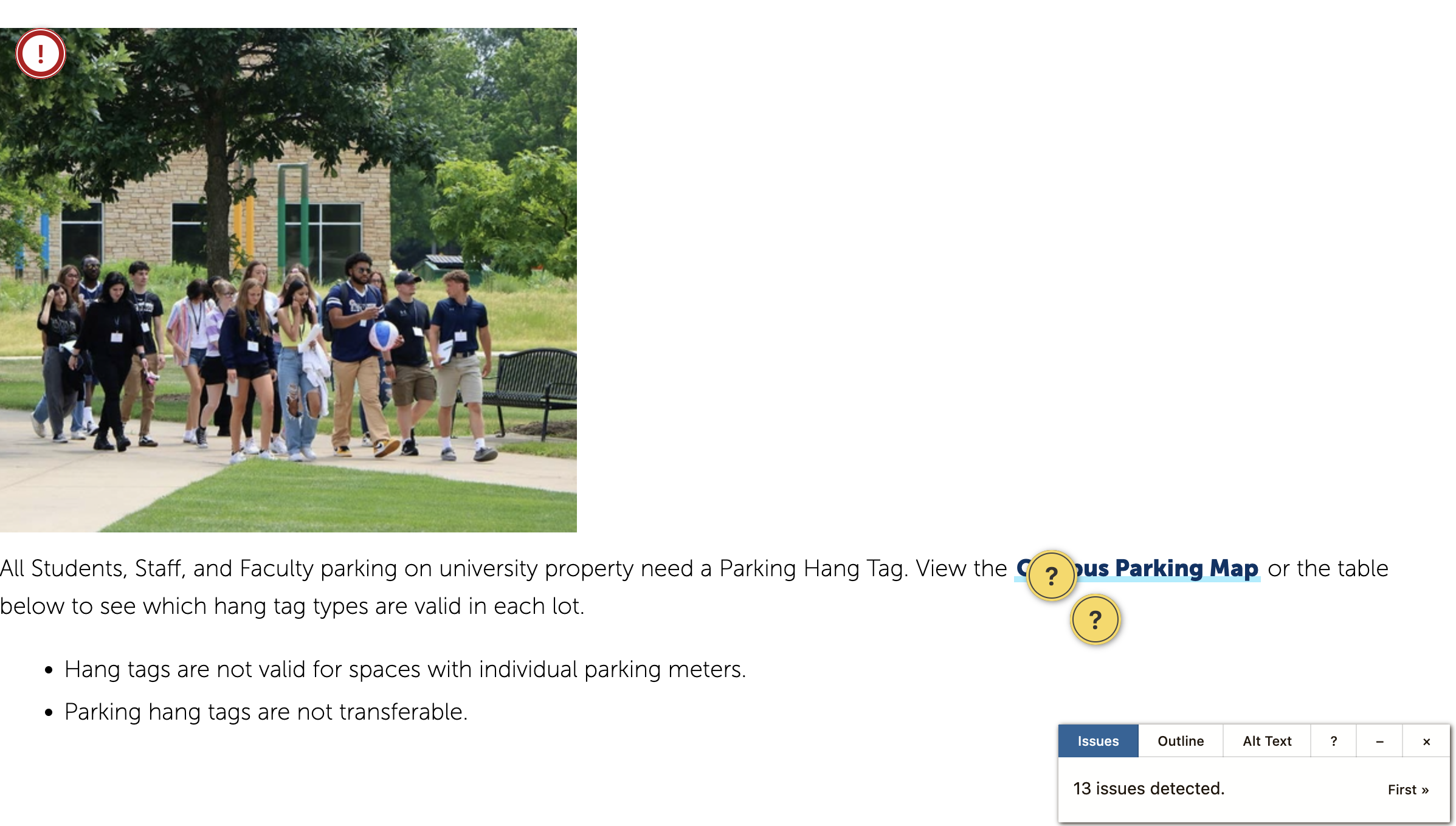
Issues Tab
From here, you can look over your page to find the flags the checker has found. You can hover over the indicator icons to see what is wrong.
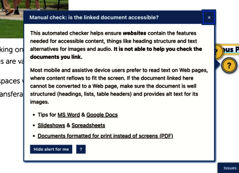
Now you can open the editor for your page in a new tab or page and use the checked page as a reference to fix your errors. Keep in mind: Manual Check errors for documents and media will always appear as errors on your page. You will not be penalized for them appearing, but always check and fix these errors when appropriate.
Outline Tab
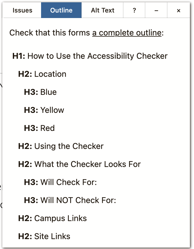
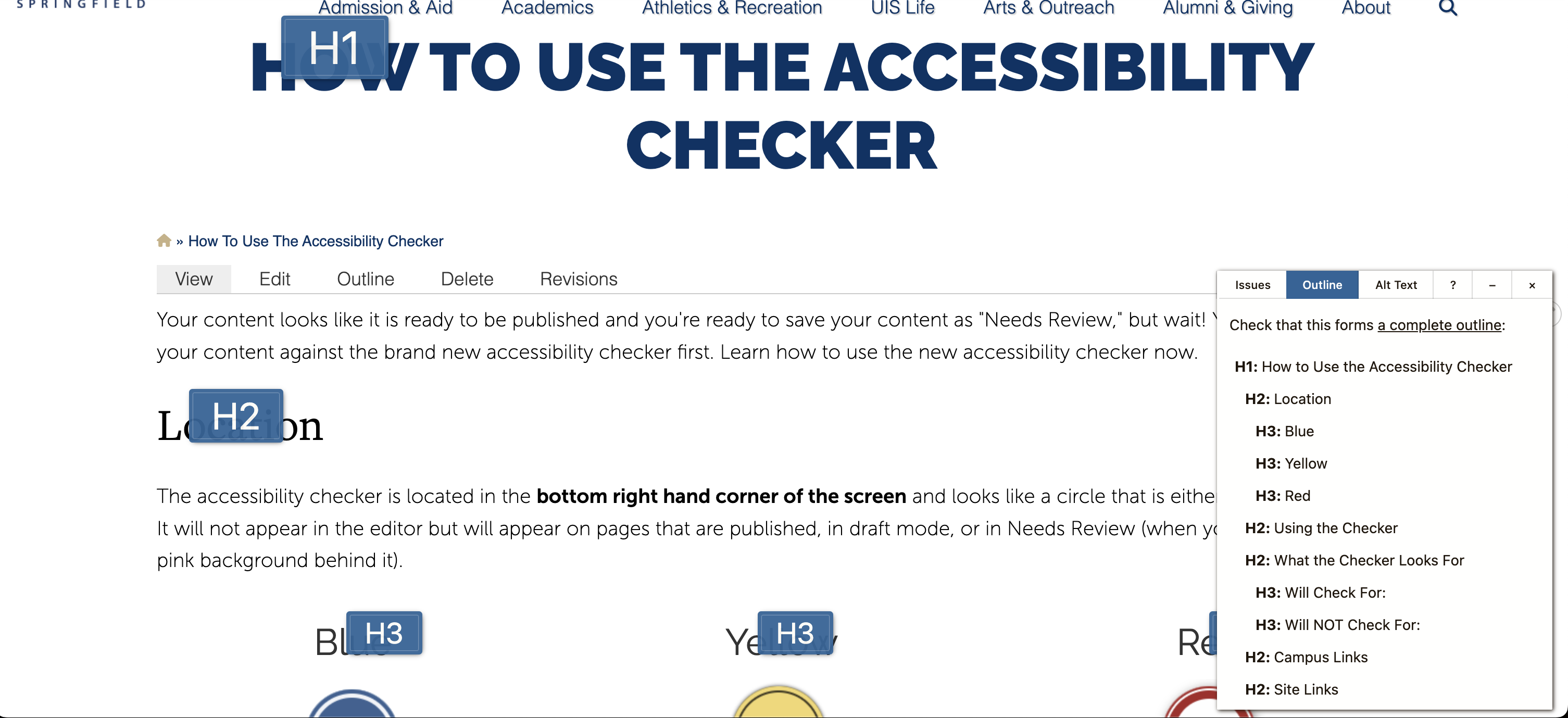
You can select the Outline tab on the checker to see an outline of headings on your page. Use this to see if your headings make sense, are in order, or to see if anything is missing. Selecting the Outline tab will highlight the headings on your page as well. This can also give a sense of how people who use screen readers navigate a page. Try it out on this page to see!
Alt Text Tab
Alt text is a very important accessibility element to add to your images. It is a "short and sweet" description of what's going on inside the image that helps give context to why the image is on the page. It's also easy to forget to add!
Luckily the Accessibility Checker has its own Alt Text tab to help you keep track of your alt text: to see where you might have forgotten one, get an overview on the quality of your alt text, and you can get a preview of what the alt text looks like in place of your images. Having the Alt Text tab open will superimpose your alt text over the images so you can get an idea of why the alt text is important to add context to the rest of your content.
Try it out on this page!
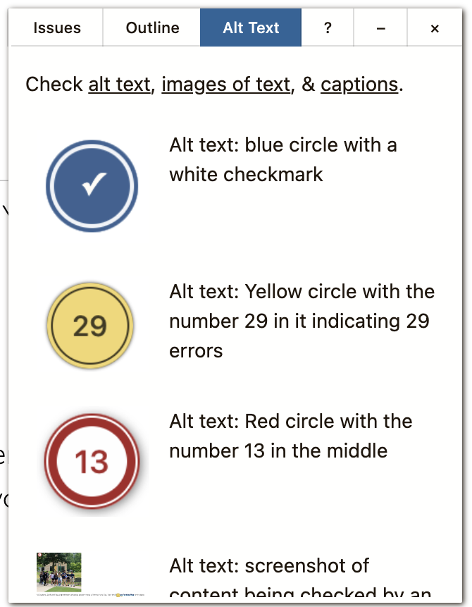

After you have fixed all the errors and have gotten the page down to a blue circle (or a yellow circle with the lowest amount of manual checks possible), you can submit your content for review or publish it depending on your role.
Note: If you come across an error that you are unable to fix, please email us at web@uis.edu.
What the Checker Looks For
Will Check For:
- Headings
- Skipped heading levels
- Empty headings
- Very long headings
- Alt Text for Images
- Missing alt text
- Images with very long alt text
- Alt text that contains redundant text like "image of" or "photo of"
- Meaningful Links
- Links with no text
- Links with only a filename
- Links titled with only generic text like "this link," "click here," "learn more," etc.
- Links that open in a new window
- Tables
- Tables without headers
- Empty table cells
- Tables used for layout
- General content quality
- Lists made from asterisks, numbers, and letters rather than list elements
- Lots of CAPS LOCK text
- Links to PDFs and other documents/media to remind users to check their accessibility
Will NOT Check For:
- Images with text in them.
- Color Contrast that needs to be strong enough for low vision or colorblindness users. You'll want to use a checker like WebAIM's Contrast Checker
- Using sensory characteristics that change when layout or color perception changes. For example, avoid using language like "the forms in the right hand column need to be completed." This loses meaning when the layout of the page is changed, for example, on a mobile device.
- Redundant links. Please avoid linking to the same place more than once on a page.
- Working links. Please check to make sure all your links work.
- Using H1 headings. Please start at H2 and work your way through H3-H6 as indicated in the Content Review Guidelines.
- Bolding and italicizing full sentences instead of keywords and key phrases.
- If your document is actually accessible. It will only give you a Manual Check to remind you to check your documents. To make sure your documents are accessible, please contact the Office of Digital Accessibility.
- Headings or sentences as links
- Catalog Content
- Duplicated Content
Please note that the checker will not check for everything, so always also check your content against the Content Review Guidelines.

