What is color contrast?
According to WebAIM, “contrast is a measure of the difference in perceived ‘luminance’ or brightness between two colors.” Contrast is expressed as a ratio with a range of 1:1 (both colors are the same; for example, white text on a white background) to 21:1 (for example, black text on a white background).
To meet Web Content Accessibility Guidelines (WCAG 2.1), the contrast ratio minimum is, generally, 4.5:1. However, there are a few exceptions:
- Large text must have a minimum contrast ratio of 3:1. WebAIM defines large text as either text that is both 14 point or larger and bold or 18 point or larger (bold or not).
- Incidental text or images do not have contrast requirements. Incidental text or images might refer to pieces of content that are purely decorative.
- Logotypes, or text that is part of a logo or brand name, have no contrast requirements.
Why it matters
Color contrast affects the readability and navigability of web content. All users benefit from good color contrast. For example, consider times where you’ve seen yellow text on a white background. These two colors have very low contrast, and it can be difficult to discern between them, especially from a distance. If someone were to use this combination of colors on a PowerPoint for a presentation, as an audience member, you’d probably be frustrated, confused, or distracted because you’d be focusing on attempting to read what’s on the screen instead of what the presenter is saying. The presenter’s PowerPoint is no longer a visual aid; it’s a hindrance to the presentation overall.
Good color contrast is especially important for low vision or colorblind users. Without adequate contrast, these users might miss important text or have a hard time interpreting graphs, charts, or other visual aids. To get a good idea of how those with color vision deficiencies might see some of your content, you can use the Color Blindness Simulator (Coblis for short).
How to fix it
Before diving into some fixes in PowerPoint and UDOIT specifically, we want to revisit that contrast ratio minimum from earlier. While 4.5:1 is considered accessible, it’s important to recognize that this is the minimum, and you should still use your judgment to determine the readability of content. For example, review the following lines of text, which all meet the minimum contrast ratio requirement:
- Gray text (hex code: #767676) on a white background (hex code: #FFFFFF)
- Purple text (hex code: #CC21CC) on a white background (hex code: #FFFFFF)
- Blue text (hex code: #000063) on a gray background (hex code: #808080)
- Red text (hex code: #E60000) on a yellow background (hex code: #FFFF47)
Some of these lines of text are more readable than others and might vary in readability from user to user. Accessibility checkers are unlikely to flag these lines of text as issues since the minimum requirements are met. When in doubt, you should aim for a contrast ratio that exceeds 4.5:1, just to be sure your audience has a positive experience on your website, in your Canvas course, or at your presentation.
Fix it in PowerPoint
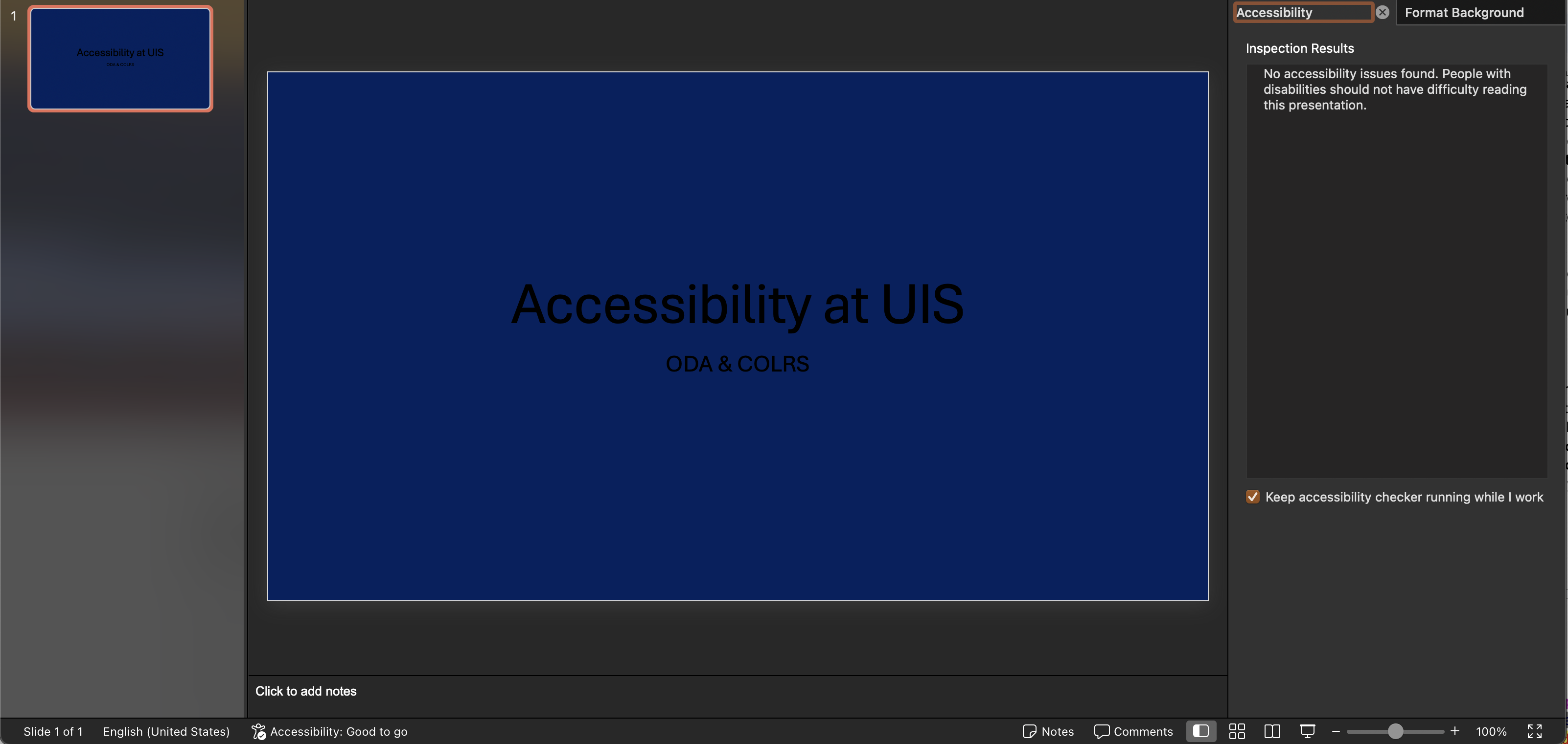
Microsoft’s support page about making PowerPoints accessible suggests that the built-in accessibility checker will “find insufficient color contrast.” However, the screenshot below shows a slide with a blue background (hex code: #002060) and black text (hex code: #000000), which only has a contrast ratio of 1.37:1.

In this image, the accessibility checker has not detected any issues and states that “people with disabilities should not have difficulty reading this presentation,” but with such low contrast, most users would likely have difficulty reading this presentation, with or without disabilities. Unfortunately, the accessibility checker within PowerPoint itself should not be the sole means of assessing color contrast.
Instead, if users are customizing colors or themes for their presentations, using something like WebAIM’s contrast checker is a great way to ensure content is accessible. If you know the hex values for the colors you’re using, you can type those in directly. Otherwise, you can use the color picker to find your color using the sliders or the dropper icon.
Microsoft also states that their built-in slide designs are created with accessibility in mind. Like we’ve mentioned previously, it’s still worth double checking and using your own judgment, but if you’re using the built-in designs with no text or background customizations, you’re probably on the right track for having an accessible presentation.
Fix it in Canvas UDOIT
When you scan a course with UDOIT, color contrast issues are marked as errors (defined as “issues that [Cidi Labs] can confidently determine need to be resolved for accessibility”). You can identify these errors by looking for issues called “Insufficient Text Color Contrast With the Background.”

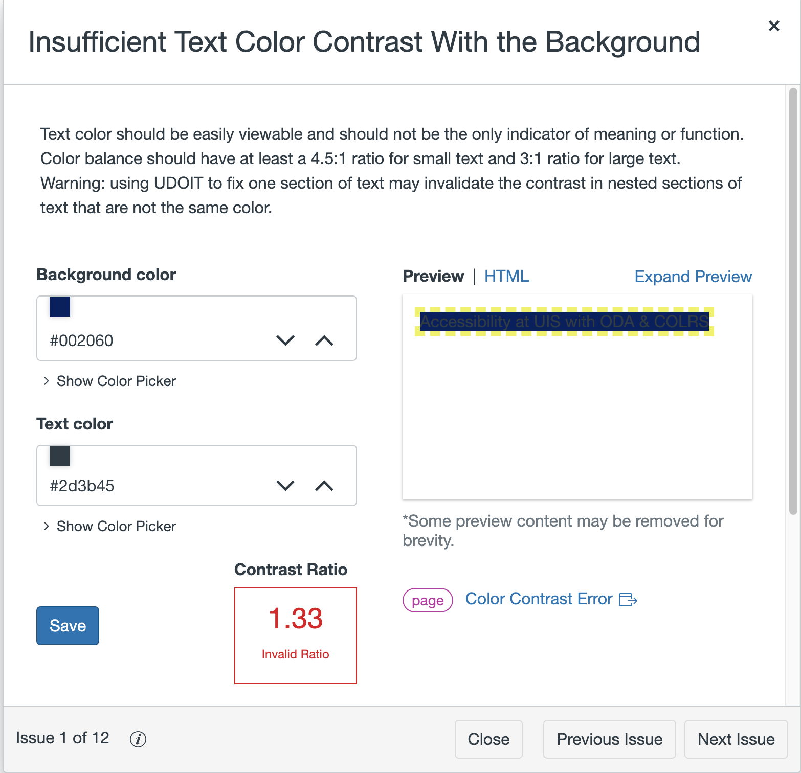
When you click on the Review button, you’ll get a short description of what you need to do in order to remediate the content. For color contrast issues, you’ll also be presented with a box for the background color and the text color.

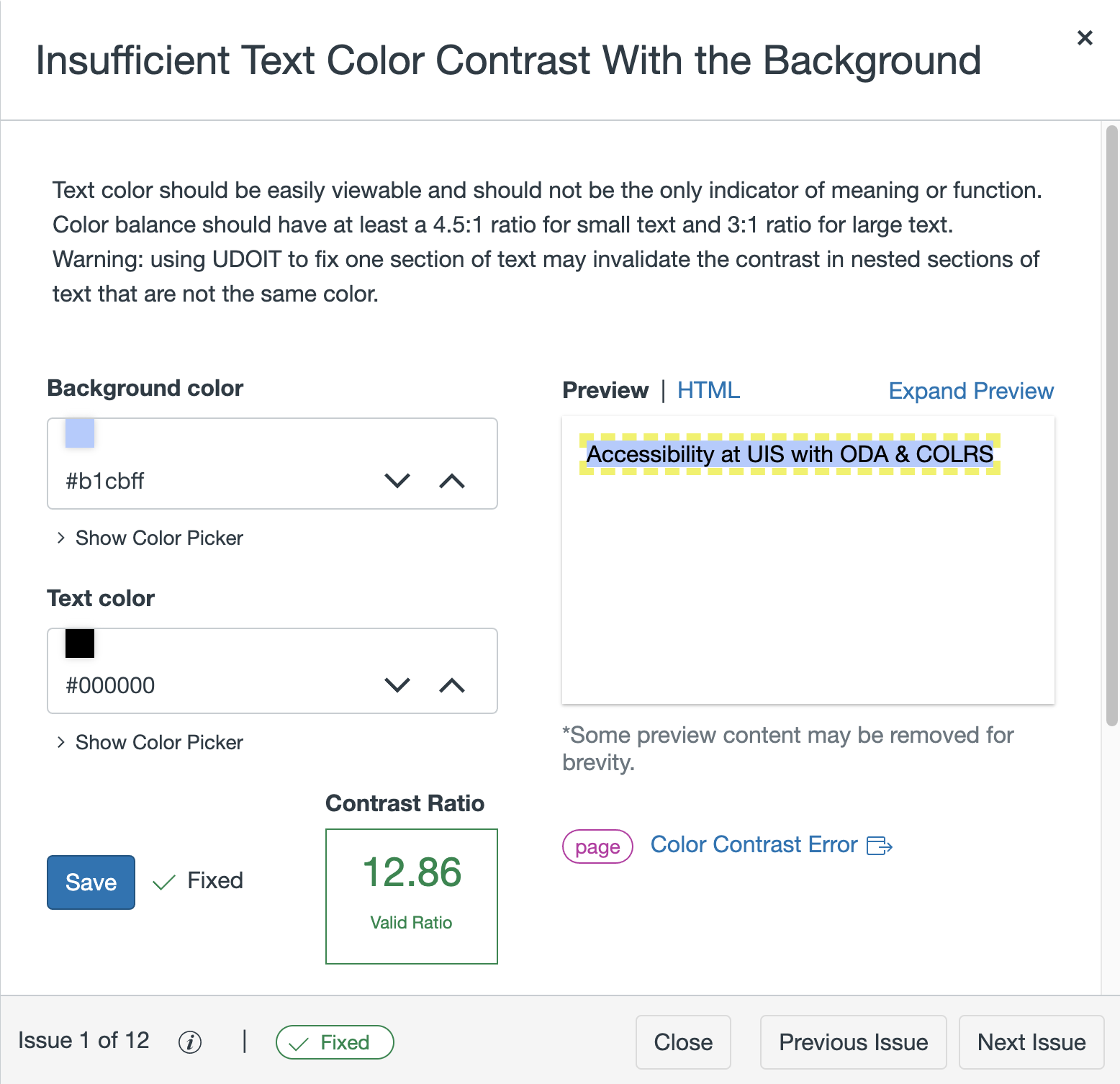
Fixing color contrast issues in UDOIT is pretty straightforward; you can click the up arrow to make the color lighter and the down arrow to make the color darker for both the background and the text colors. This allows you to make gradual adjustments until you find a color combination with adequate contrast. You can also use the color picker if you want to make more drastic changes to your content.
You’ll know when you’ve hit the minimum contrast ratio threshold when the “Contrast Ratio” box switches from red with the “invalid ratio” text to green with the “valid ratio” text. Again, the minimum still might not be easy to read, so keep an eye on the preview on the right to determine if there is enough contrast.

To see the UDOIT remediation process in action, check out the UDOIT color contrast tutorial from COLRS!
Fix it with ODA & COLRS
Join the Office of Digital Accessibility and the Center for Online Learning, Research and Service for a 30-minute workshop on tackling color contrast issues in PowerPoint and Canvas.
- What: Fix It: Color Contrast in PowerPoint & Canvas Workshop
- When: Thursday, September 26, 11:00 a.m.
- Where: COLRS Zoom Room


